ARCANA SKIN

Late last year, Erin from Arcana Skin, formerly Aster and Bay, sent me an email enquiring about doing a still life shoot for their rebrand Spring launch. As someone who loves skincare, I was really excited about the possibility of working with her—my first skincare client! After a short back and forth, we met for a cup of tea to discuss the direction of the shoot. With existing clients, a lot of times the whole thing is organised via email but with prospective clients, I find it invaluable to meet in person when possible to establish working chemistry and build a strong rapport from the beginning. Text-based communication is great for organising logistics but not so much to hone down on more nuanced details and the aesthetic feel.
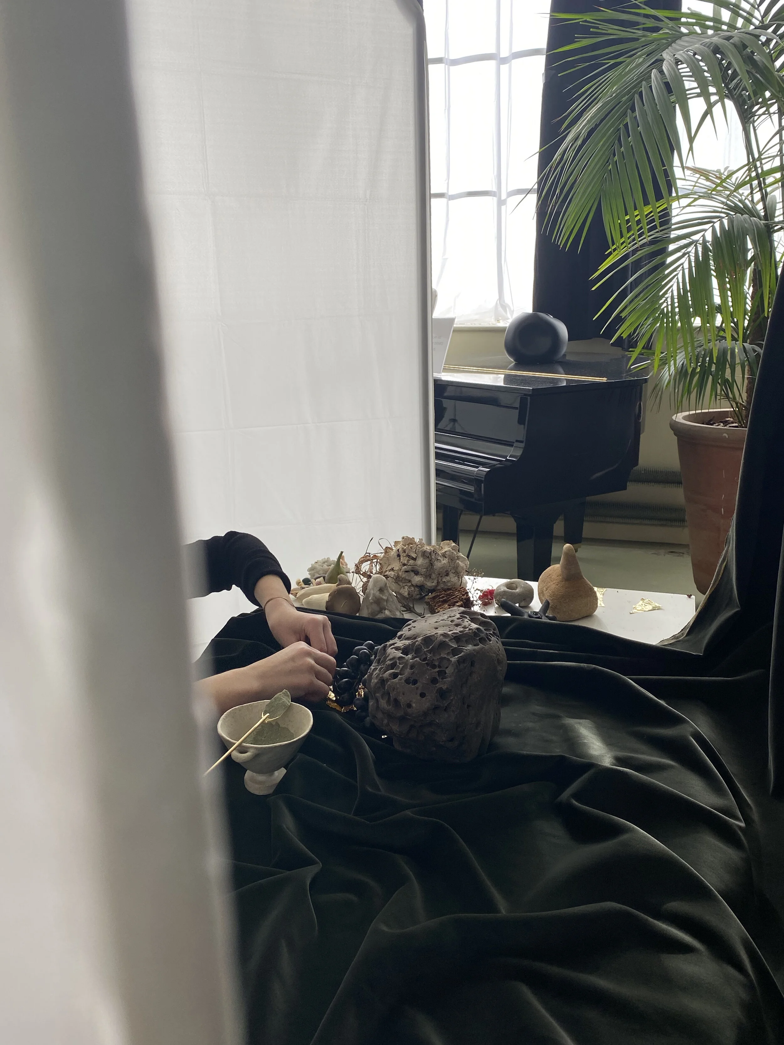
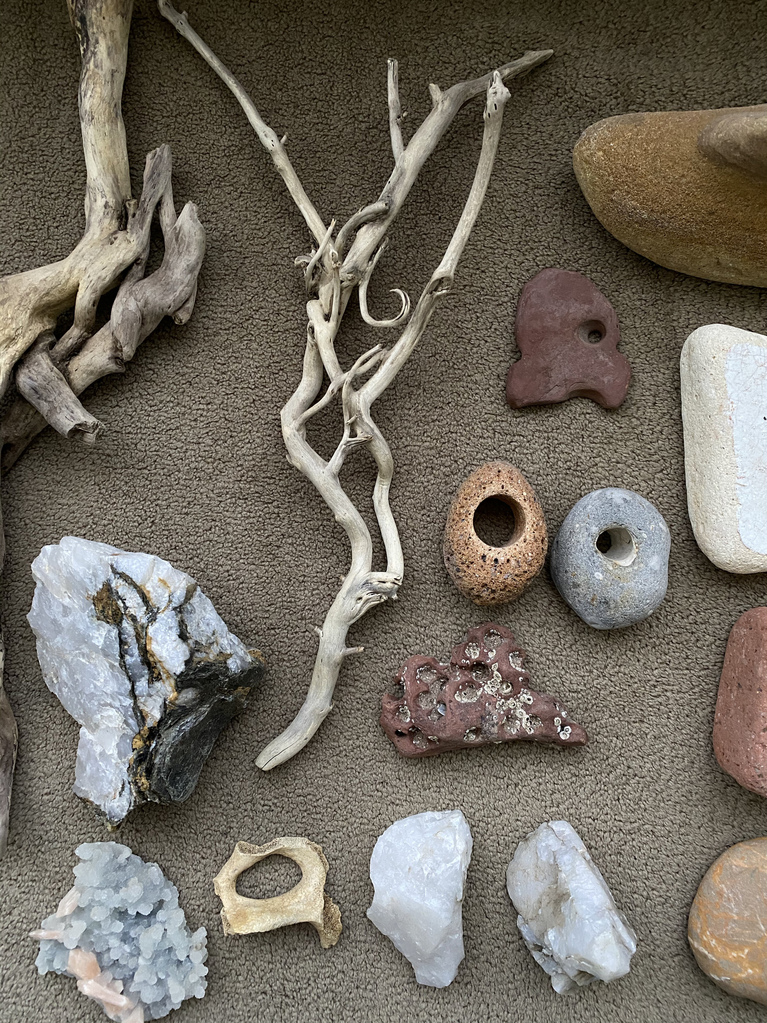
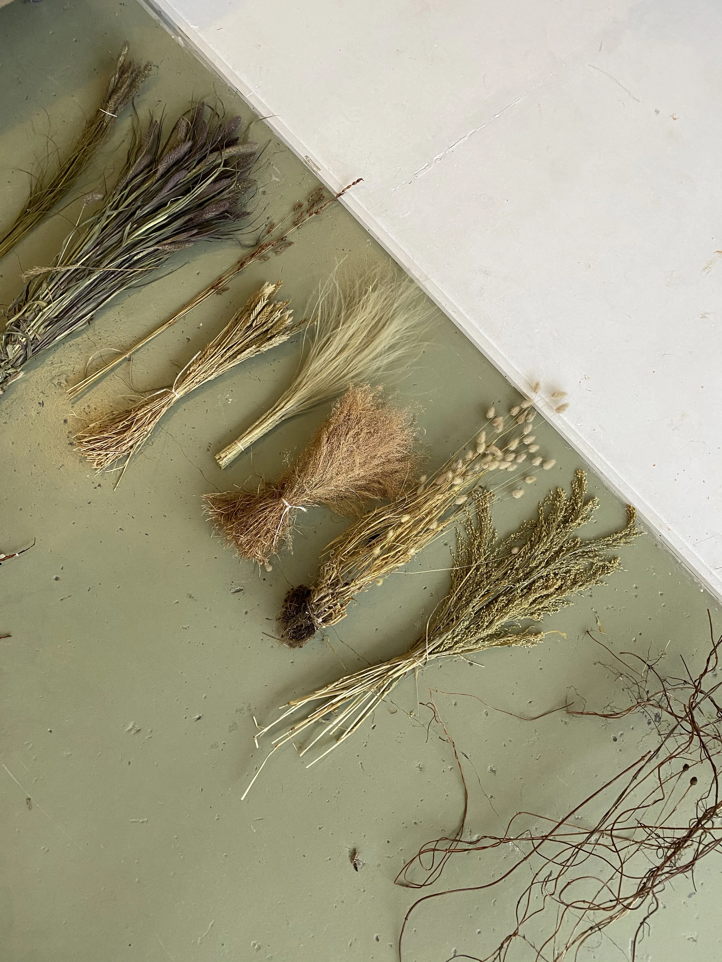
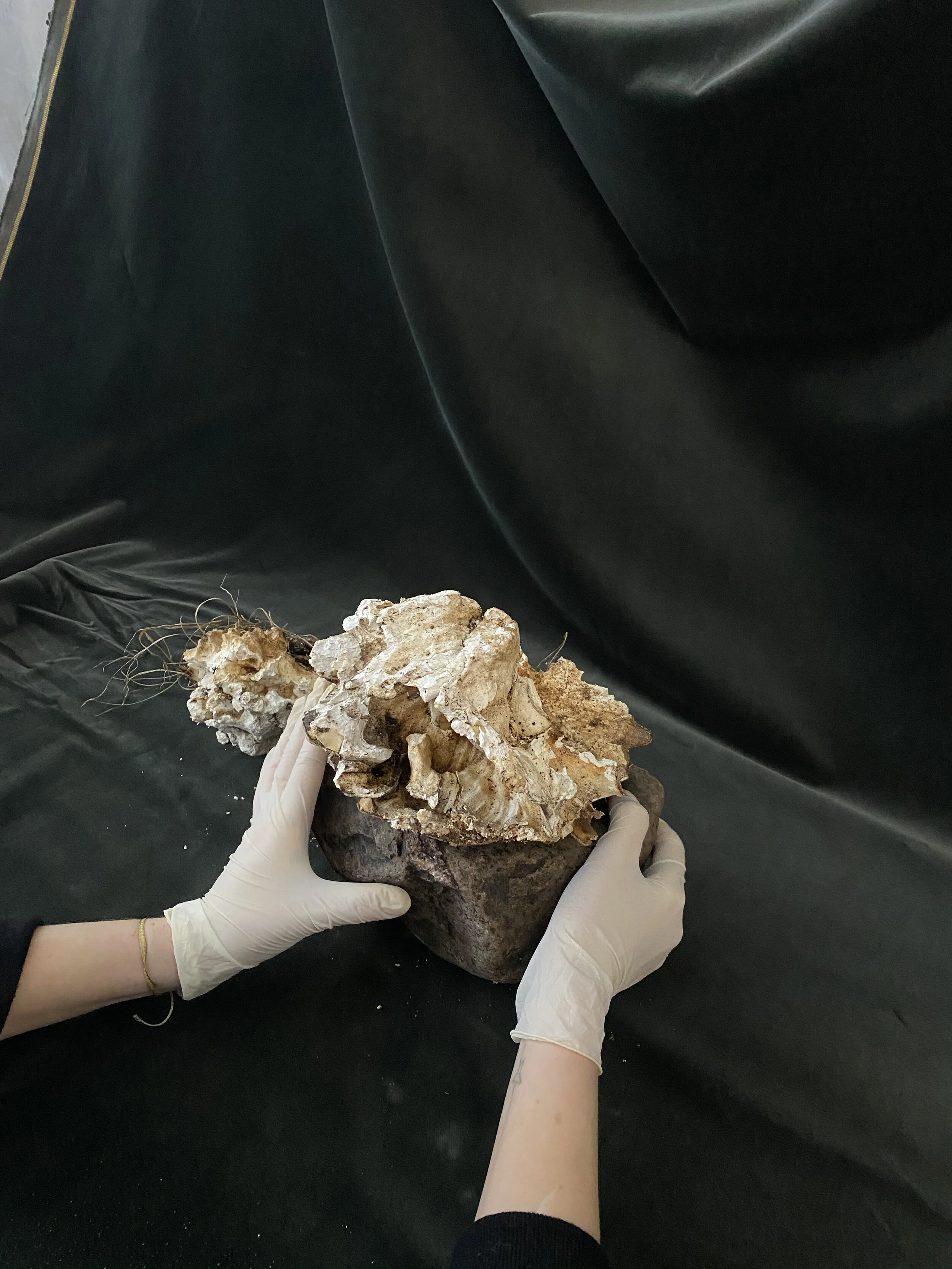
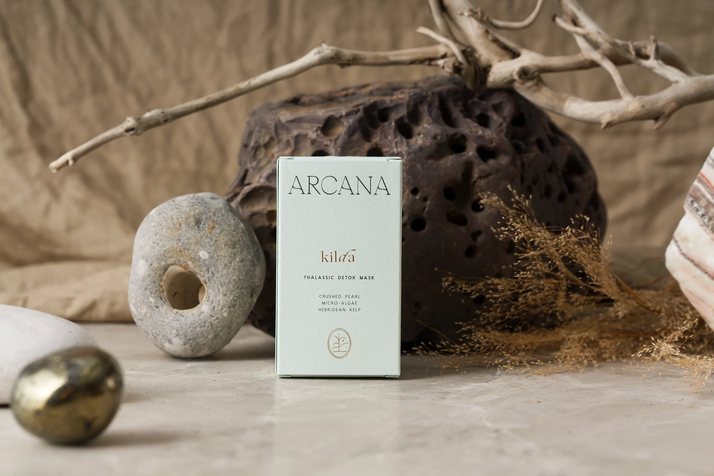
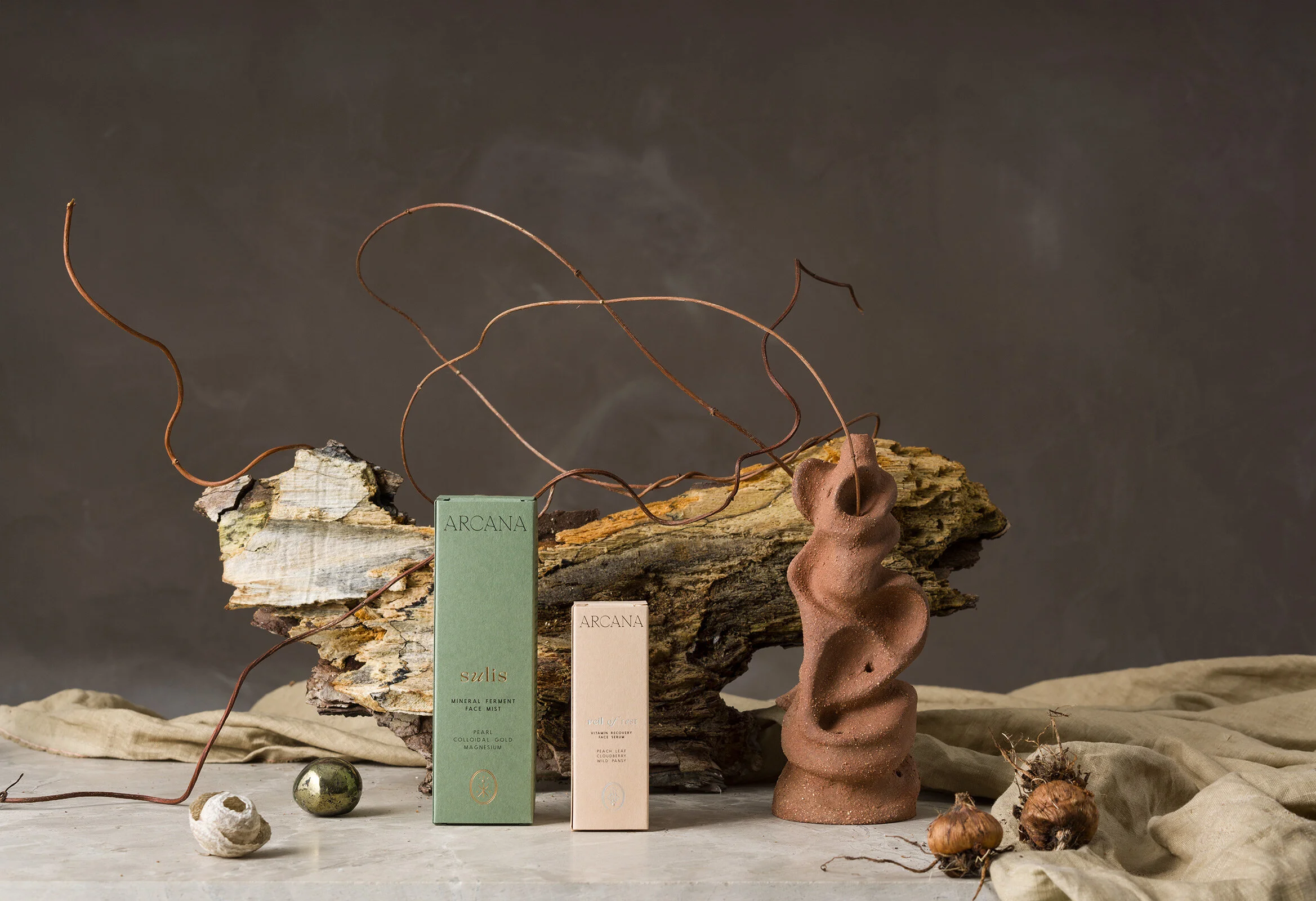
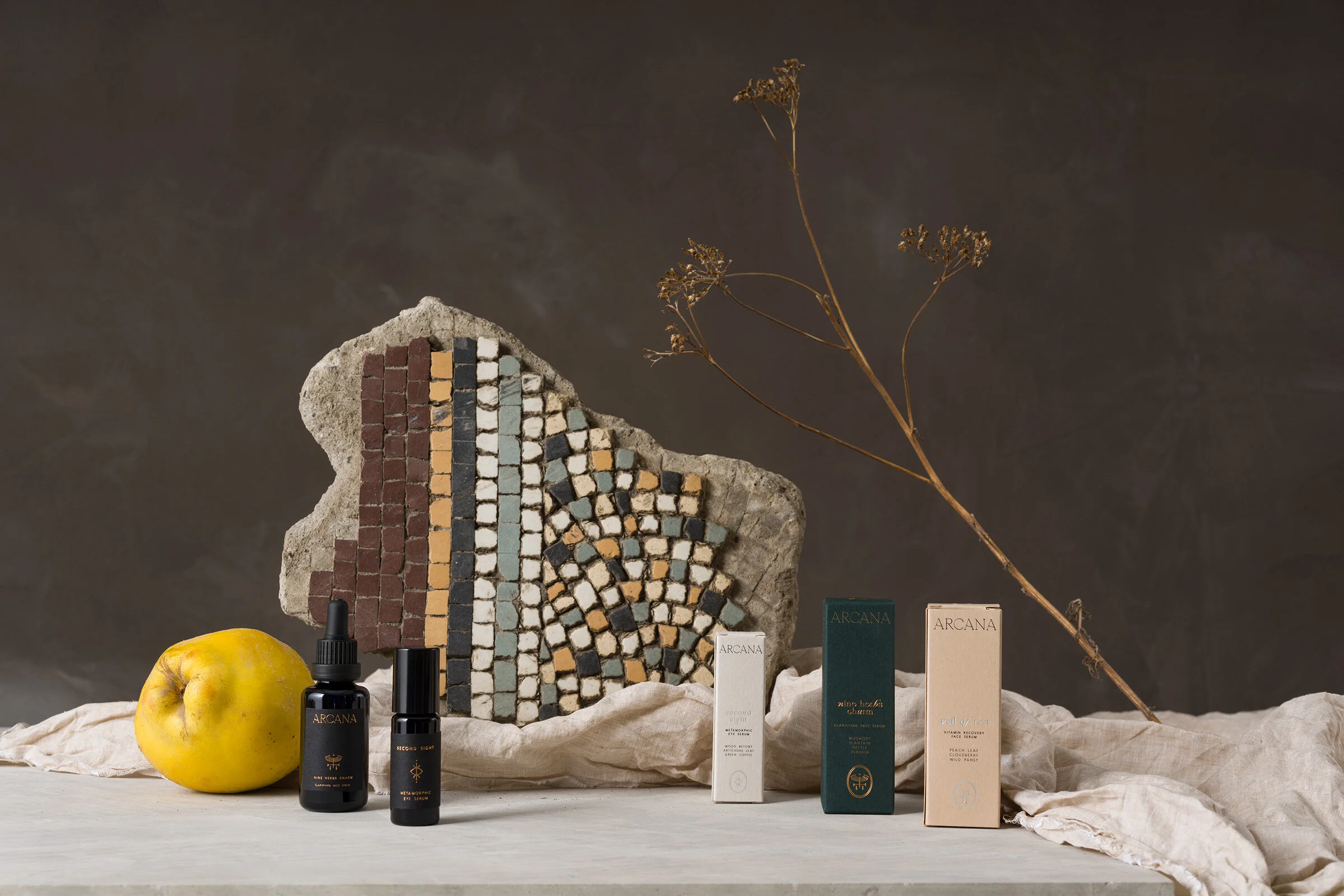
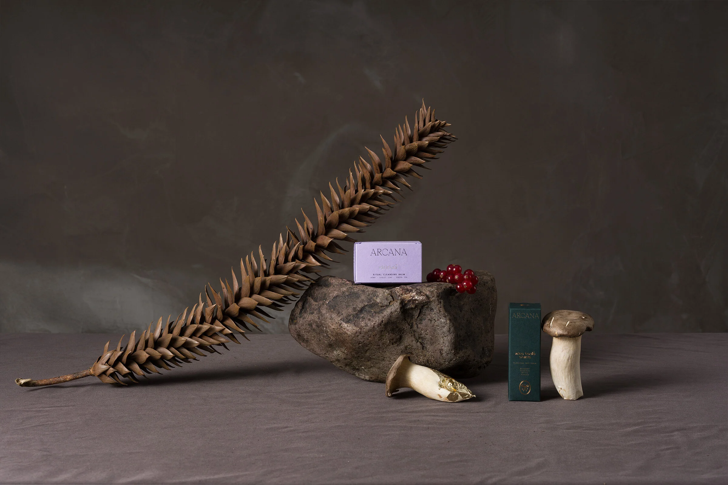
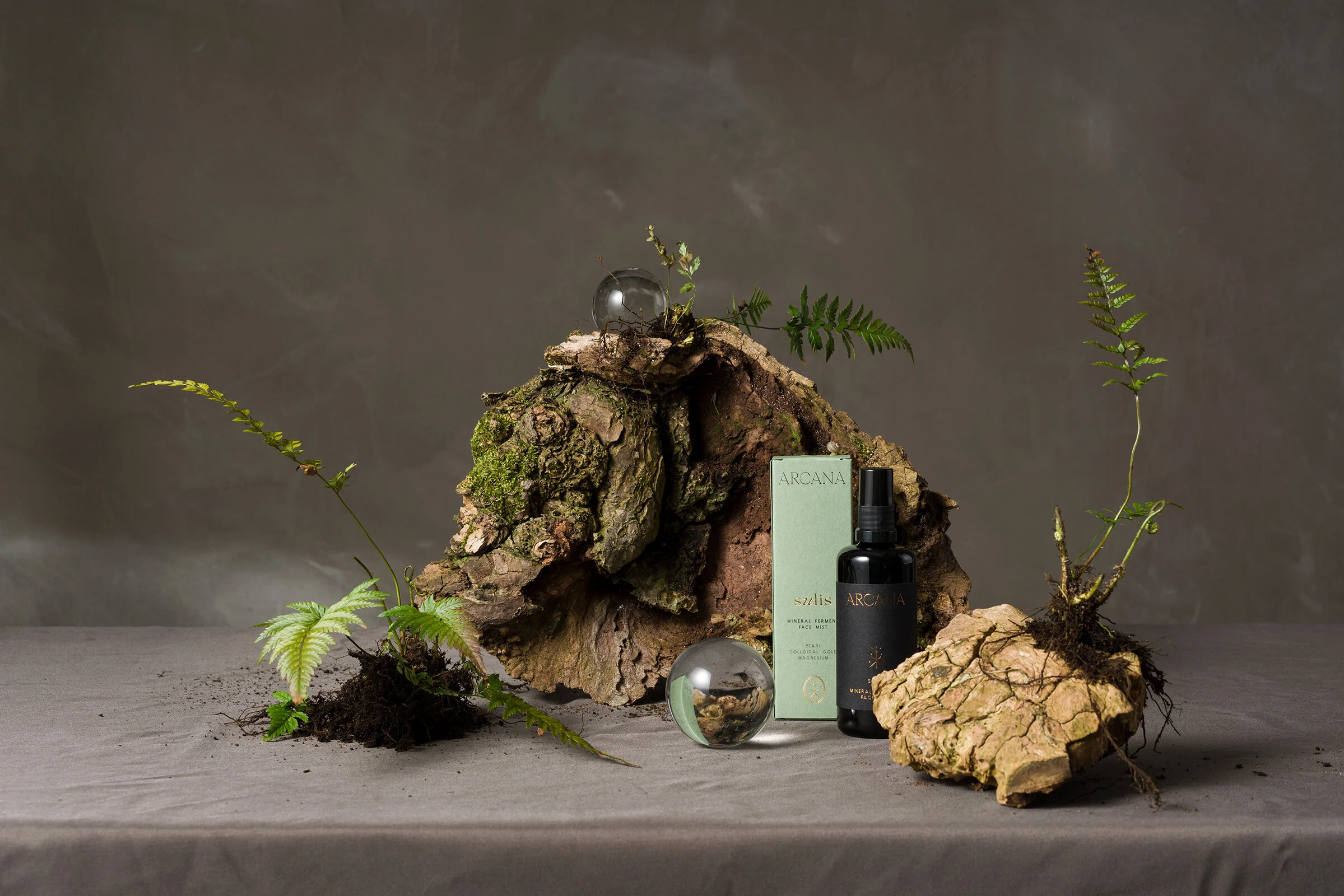
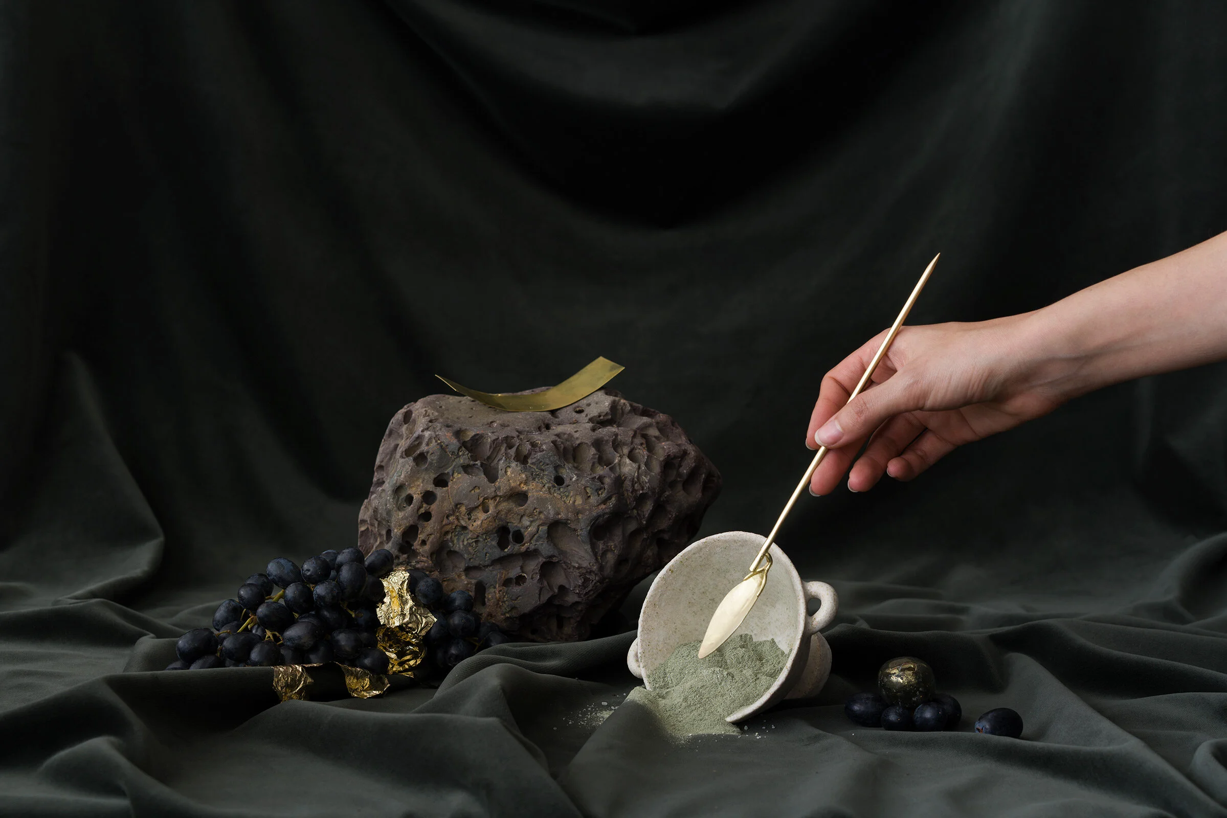
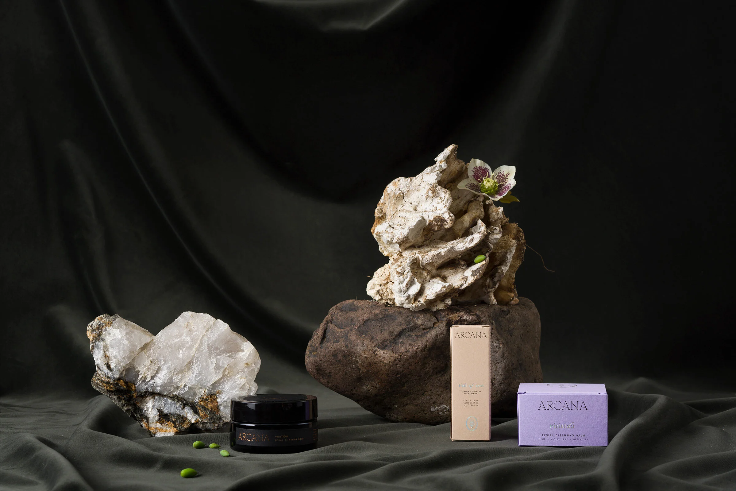
A minimal but richly textured and tactile set is what we decided to go for, a balance between storytelling and showcasing the products. To commandeer the set styling I suggested we bring in PYRUS as not only they’re one of my favourite botanical studios to work with, they also share a love for the history and meaning behind plants, and obviously have a great bounty of beautiful roots, minerals and other less flowery goods—which was set to make the bulk of the styling.
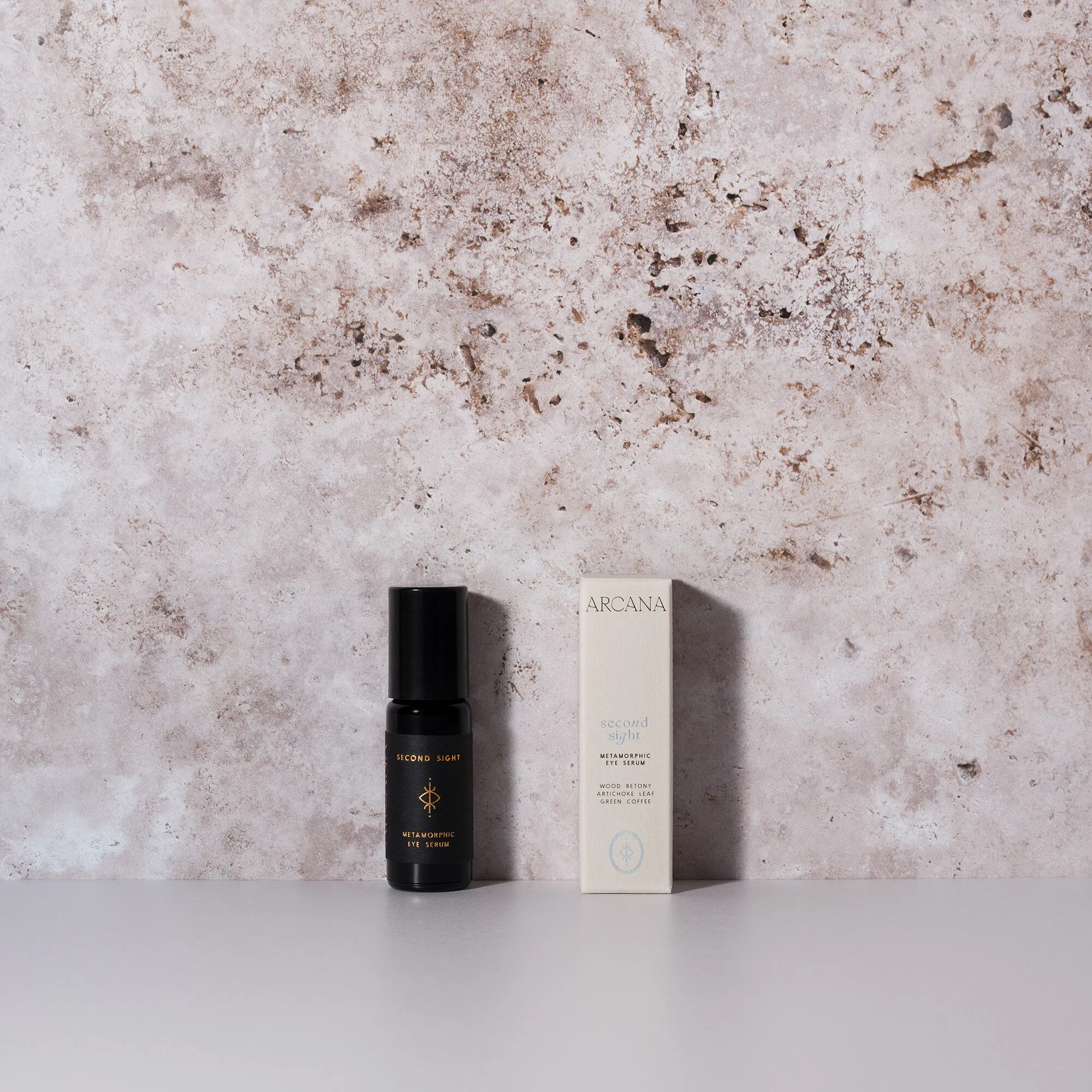
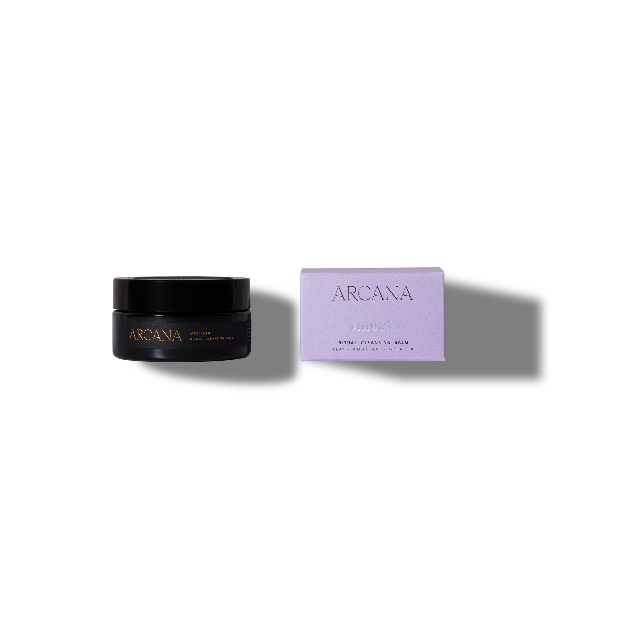
We agreed then I would also be doing the e-commerce product photography for Arcana to keep things as local as possible. With the rise of sustainability as a marketing tool, it’s great to see and work with companies that ensure every part of their business is as sustainable and eco friendly as possible. In e-commerce photography, it’s important to establish present and future needs for the images. A client might want a more brand orientated look (eg colourful or textured background) but then later finds out most magazines will ask for true white backgrounds. That might be a simple post production fix but sometimes, say if you’re photographing translucent products, it will incur extra costs in the future to photograph the products specifically for that need. Erin already knew she needed transparent cutouts for her website but as the bottles and boxes are opaque, I suggested we photograph on a textured background initially and then cut the products out—whereas a little more work on the cutting part, that meant Erin had more elaborate product images also, in case her or her suppliers wanted to use on social media.


At the end of March we photographed the styled images for Arcana, the very last team shoot I did before lockdown. By a stroke of luck we had set a date which fell just four days before lockdown was announced and we could all be on set with proper social distancing. The day started as it normally does—a frenzy in which you doubt you’ll get through the shot list because the initial set up takes longer than you expected. The first couple of hours of the day more often than not feels like a warm-up routine where the whole team is settling into working together. Add that to setting up lights whilst there’s people unpacking and organising a whole bunch of props into possible sets, it certainly can feel like a chaotic dance.
Having already photographed the products before, I already knew the light setup I would be mostly using this time—a snoot behind a scrim as the key light on the right with a board on the left for fill. Using a snoot behind a scrim gives a more defined shadow whilst still keeping an overall soft look and you can fine tune the softness by moving the snoot further or closer to the scrim.
Some final images from that day below:
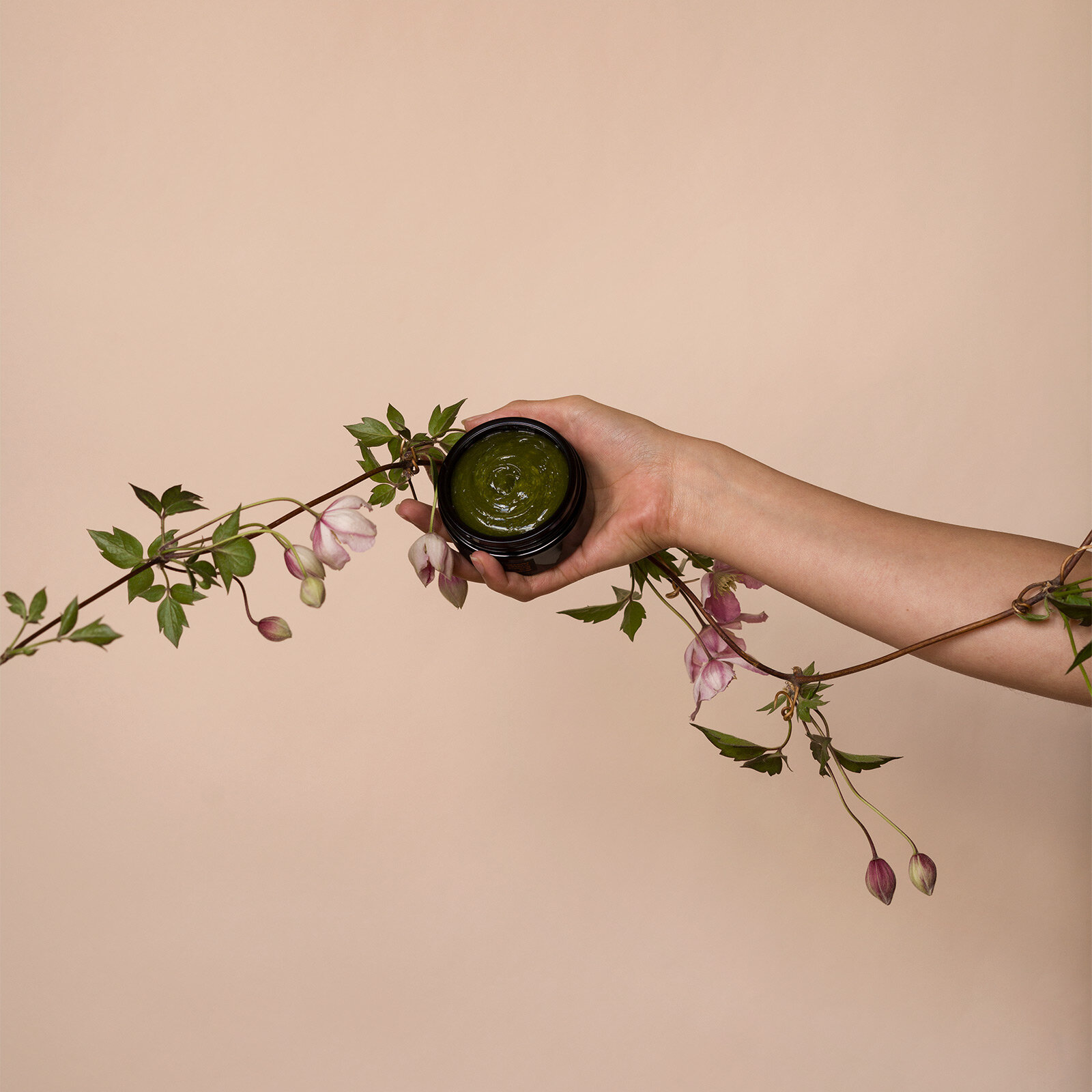
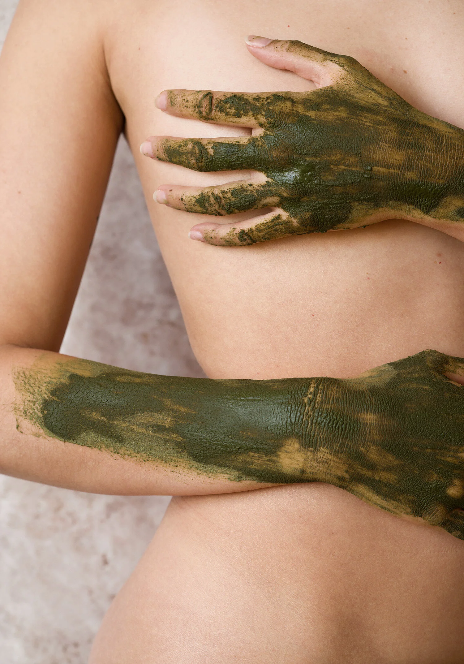
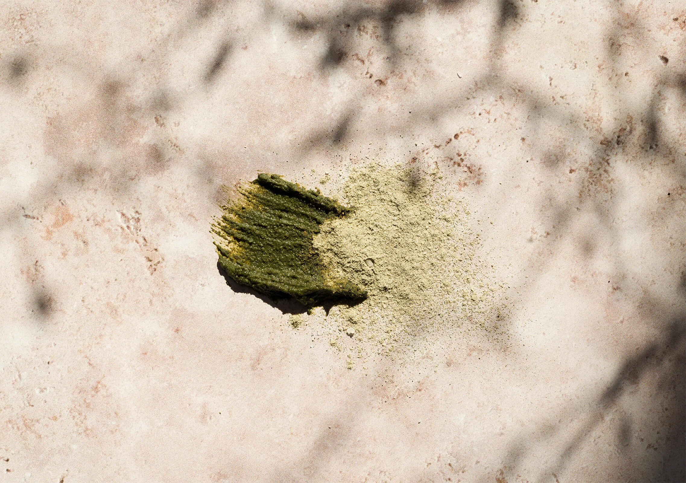
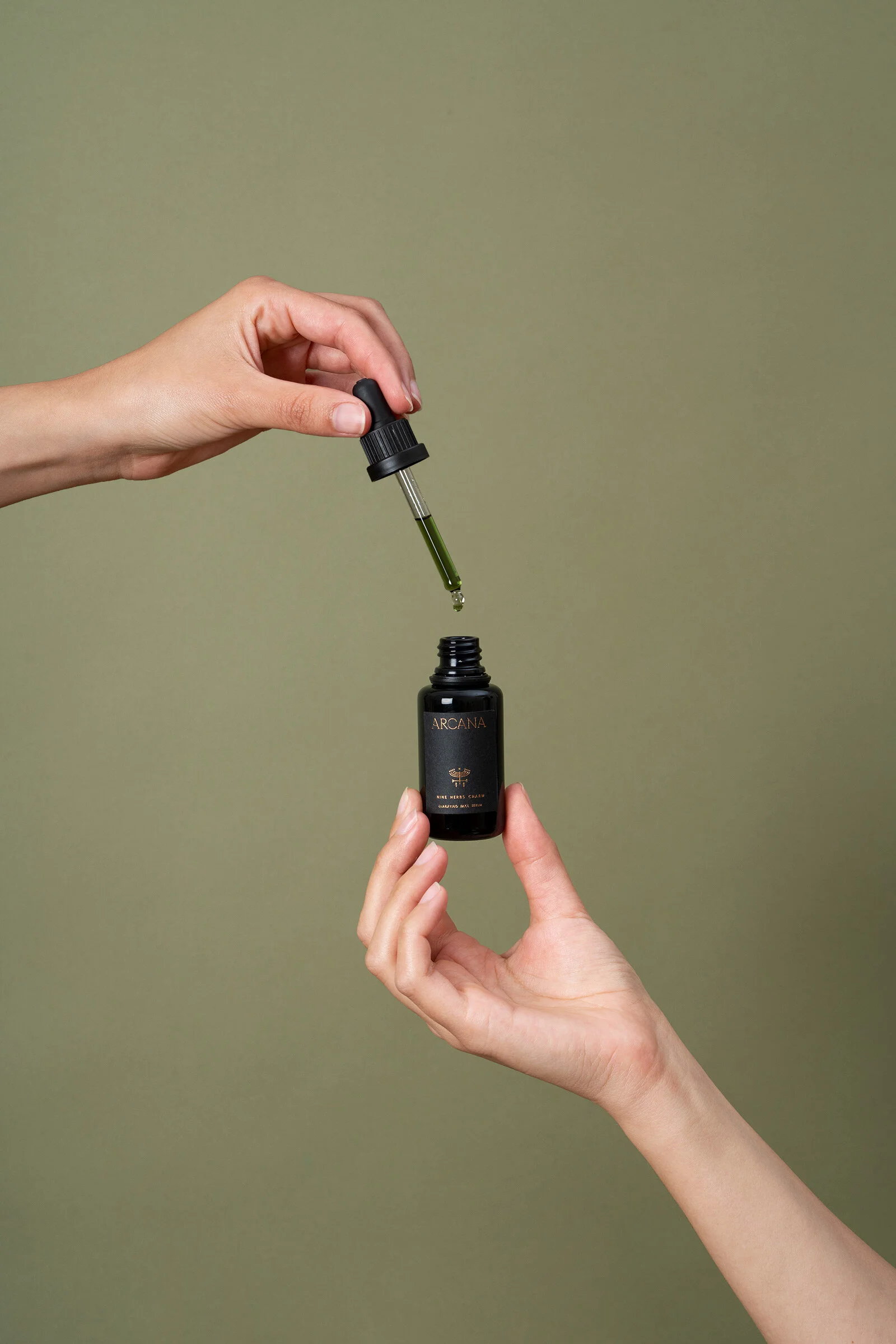
During lockdown I’ve been creating some digital content for Arcana using resources and props I already have, including myself as a model until lockdown is fully lifted and we can work with teams again. Arcana strengthens the brand on their instagram feed by making careful choices on colour, the verdant green invoking nature and the natural realm is interspersed with contrasting fleshy tones. Having strong brand guidelines like that from the beginning make it much easier to produce cohesive content.